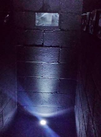
Today I carried on with installing the images into my space, and finally it is done! I am really relieved to have done this in such a short time, as it was looking today like I would not get it finished for the opening tomorrow. I am really pleased with how the room has turned out and how many images I managed to fit into one tiny space (I lost count at 430)
I also decided at last minute not to use my LED lights again, as I felt that the working light in the room (shown previously on another blog post) worked really well with the work that I installed.
Here are some images of my piece:
I am really excited for the opening night of the exhibition and hope to get talking to some people about my work. I can not believe another semester has passed by so quickly either and all of the work is due in next week! I have definitely achieved what I wanted to this semester and finally like the way I am working!
Monday, 5 May 2014
Wednesday 30th
Today, I finally started to install my work into the space. A bit of a surprise though when no one actually returned the help that I had given them in the past few days, although I can probably manage to finish installing mine by tomorrow evening.
A progress image below:
This is a picture of the room about half done! I was having a bit of a panic about this earlier on today, but spoke to a tutor and got told to keep going with it, which I will do tomorrow after a bit of a break - the sound of rustling paper is beginning to annoy me a little.
(The white sheets of paper which you can see is what I am using to build up the paper so it eventually fills the room, I didn't think of using larger items such as boxes or even newspaper, but will keep on using this as it appears so far to be a good method)
A progress image below:
This is a picture of the room about half done! I was having a bit of a panic about this earlier on today, but spoke to a tutor and got told to keep going with it, which I will do tomorrow after a bit of a break - the sound of rustling paper is beginning to annoy me a little.
(The white sheets of paper which you can see is what I am using to build up the paper so it eventually fills the room, I didn't think of using larger items such as boxes or even newspaper, but will keep on using this as it appears so far to be a good method)
Tuesday 29th
Again, today I helped out my classmates again in the morning, as I had nothing else really to do. I have my images all printed out and ready to install but I spent the afternoon painting the entrance floor of my space, as I managed to get hold of some black paint!
Images will be installed tomorrow.
Exhibition installation week!
So yeah, I didn't post anything again for a while! Nothing major has really developed in my Studio Practice, as I mentioned I have been focusing on the PPAP unit!
This week we will be installing our exhibition, and I am really excited to see how this will pan out.
I returned to the studio today ready to install my part of the exhibition, however when I arrived, I found out that the floor of my dark space hadn't been painted - as they had ran out of grey floor paint! Typical. I spent the morning mopping the floor in my space, then helped out some of my classmates to install their parts of the exhibition.
This week we will be installing our exhibition, and I am really excited to see how this will pan out.
I returned to the studio today ready to install my part of the exhibition, however when I arrived, I found out that the floor of my dark space hadn't been painted - as they had ran out of grey floor paint! Typical. I spent the morning mopping the floor in my space, then helped out some of my classmates to install their parts of the exhibition.
End of year show planning
I haven't blogged in quite a while. I have been super busy planning what I am going to do for my end of year show exhibition and it has been stressing me way more than it should be.
I requested the space which I used for my test exhibition, for the final show! And I got the news I am able to use the space again, which I am really excited about. I am also carrying on with using the screwed up images.
In my proposal I wrote that I am planning on filling the small dark space with images, which is what I still intend to do! I am really looking forward to the end of year show, and I am looking forward to what I can achieve with my work and how far I can stretch it.
______________________________________________
Below is an image of some work with the screwed up images that I tested out when I found out that I can definitely use the space which I requested:
I had positioned the images that I was playing about with in my space. They only filled up a tiny corner within the dark space. So I will have to figure a way which I could fill the room without printing out every image that I need, as I definitely want to fill the room to fully represent the decline of the institution. I am having mixed feelings toward whether this will work, and what feedback I will receive about it.
Anyway, this week we are preparing the studio spaces ready for the exhibition installation week after we come back from Easter - so I won't be posting again for a week or two, unless something else interesting comes about. I am going to focus on the Professional Practice and Placement unit over Easter, as the deadline is looming for that also!
I requested the space which I used for my test exhibition, for the final show! And I got the news I am able to use the space again, which I am really excited about. I am also carrying on with using the screwed up images.
In my proposal I wrote that I am planning on filling the small dark space with images, which is what I still intend to do! I am really looking forward to the end of year show, and I am looking forward to what I can achieve with my work and how far I can stretch it.
______________________________________________
Below is an image of some work with the screwed up images that I tested out when I found out that I can definitely use the space which I requested:
I had positioned the images that I was playing about with in my space. They only filled up a tiny corner within the dark space. So I will have to figure a way which I could fill the room without printing out every image that I need, as I definitely want to fill the room to fully represent the decline of the institution. I am having mixed feelings toward whether this will work, and what feedback I will receive about it.
Anyway, this week we are preparing the studio spaces ready for the exhibition installation week after we come back from Easter - so I won't be posting again for a week or two, unless something else interesting comes about. I am going to focus on the Professional Practice and Placement unit over Easter, as the deadline is looming for that also!
Sizing up images
I was planning on going to the workshops after the weekend, to find out how you could resize images so they print out at bigger sizes, so I could play about with making images the size of the room. I was under the illusion that you could only do this on mac computers on specific programs, but thanks to the wonders of Google, I found out that you can do it on windows computers... on the PAINT program. I have started to play about with sizing up of images on paint and below are some of the pictures:
(A very messy studio space, piecing together the images which I printed out and planning on how I am going to stick them up)
The images below show the sized up images. I enjoyed doing this as it is something I have been wondering about for quite a while! The images I chose to use are not of the best quality, so I had to print them out to a smaller size than I would have liked to. I still think the images worked out really well, and I know how to do it for future reference! Yay.
Experiments with screwed up Photographs..
Following advice given from Jessica Longmore, I decided to take up the idea of setting myself experimental tests to do with the work which I have most recently been doing (the screwed up photographs) during the tutorial, Jessica suggested that I did 10 experiments during that afternoon, to see if any other work develops.
I took a photograph after each stage, and recorded what I did and what I thought about each "experiment":
1) I scattered the images about as Jessica had commented that it looked quite "staged" I like this as it makes the images look more throw away and forgotten.
2) I then kicked the images and they separated quite a bit. I still like how some of the images are upside down and not quite right but I don't really like the layout of how it turned out.
3) I then gathered the images back up against the wall. I really prefer them against the wall, not quite sure why. Maybe because it reflects the images which I took at the factory where all the rubbish and paper work had been scattered and left behind. I do like how some of the images you can't see at all.
4) Gathering the images into the corner, like on the original way which I laid them out. However still keeping the formation of the images the way they landed when I kicked them around the room. The edges on the photographs are really bothering me though, as Jessica commented on the "definite statement of photography"
5) I cut off the edges of some of the images. I was really conscious of cutting the edges straight, but realised when I "crumpled" them all up, they look distorted anyway. I like how the blackness of the black and white photography makes several images appear to merge into one - just like how my images in the test exhibition appeared to merge into the blackness of the room. I will try within the next few experiments to play about with the edges of the photographs which I will be using. Maybe keeping some edges on some images and cutting off some of the edges of the other images.
6) I decided to take things a bit further with the images which I cut the edges off - I completely screwed them tightly into balls, so you could not see the images which are displayed. I am not too sure about this method, not really sure why either.
7) Gathering all images into the corner of the room again. Using images with the edges cut off and also the ones with the edges still on and the completely screwed up images. I really do not like how this looks, as It looks a bit like there is too much going on. On the other hand, I like how the work looks uncompleted. Don't think I will carry on working like this.
8) Using more screwed up images. Still do not like this, as it is not giving the effect which I definitely want to achieve within the exhibition.
I took a photograph after each stage, and recorded what I did and what I thought about each "experiment":
1) I scattered the images about as Jessica had commented that it looked quite "staged" I like this as it makes the images look more throw away and forgotten.
2) I then kicked the images and they separated quite a bit. I still like how some of the images are upside down and not quite right but I don't really like the layout of how it turned out.
3) I then gathered the images back up against the wall. I really prefer them against the wall, not quite sure why. Maybe because it reflects the images which I took at the factory where all the rubbish and paper work had been scattered and left behind. I do like how some of the images you can't see at all.
4) Gathering the images into the corner, like on the original way which I laid them out. However still keeping the formation of the images the way they landed when I kicked them around the room. The edges on the photographs are really bothering me though, as Jessica commented on the "definite statement of photography"
5) I cut off the edges of some of the images. I was really conscious of cutting the edges straight, but realised when I "crumpled" them all up, they look distorted anyway. I like how the blackness of the black and white photography makes several images appear to merge into one - just like how my images in the test exhibition appeared to merge into the blackness of the room. I will try within the next few experiments to play about with the edges of the photographs which I will be using. Maybe keeping some edges on some images and cutting off some of the edges of the other images.
6) I decided to take things a bit further with the images which I cut the edges off - I completely screwed them tightly into balls, so you could not see the images which are displayed. I am not too sure about this method, not really sure why either.
7) Gathering all images into the corner of the room again. Using images with the edges cut off and also the ones with the edges still on and the completely screwed up images. I really do not like how this looks, as It looks a bit like there is too much going on. On the other hand, I like how the work looks uncompleted. Don't think I will carry on working like this.
8) Using more screwed up images. Still do not like this, as it is not giving the effect which I definitely want to achieve within the exhibition.
______________________________________________________________
I found this task really helpful and fun as it helped me with thinking on the spot in other ways which I could work and display my "throw away" images.
I quite liked the fast paced experiments but I don't think I will carry on working in a way which I set myself time limits ever again, as I was overthinking what I was going to do for each experiment, and this in a way hindered the work. I am going to however be more experimental in my work and hopefully come up with something which I can do within my end of year show which is VERY soon.
Friday, 4 April 2014
Tutorial w/ Jessica Longmore 20/03
- Use workshops to learn how to size up images on illustrator - speak to technicians.
- Think of space - fill the space - space part of work.
- Interaction with work - create obstacles - negotiate ways of moving around the space.
- I have stepped forward a lot with work, with how I am exploring space - photographically and physically - interesting development - a lot of scope for future work.
- Pictures have potential.
- Scale up images to size of the wall and explore scattered pictures together.
- Sculptural quality of images - sense of space shown in images.
- Un-trimmed edged - highlighting that it is a photograph - my own images - try trimming the edges to see if it makes a difference.
- In test exhibition - the images sunk into the blackness of the room - not defined - seemed like they were appearing through the wall - the pile seems like a definite statement about photography.
- If I trimmed the edges - images may merge into a sculptural mass.
- Try ripping, and screwing into tighter balls.
- Display the items less staged.
- Try out 10 variations and record and document.
- Set tasks - not knowing outcome - beneficial.
- Illustrator sized up images - try out variations.
- Experiment with raw materials (images) - make notes as I am going along.
- "Free yourself up" - brings more ideas - make notes and reflect.
- If I "hit a brick wall" then set experimental tasks to work on.
This tutorial really gave me confidence with my work and how it is developing. Also confidence in how I can develop my work further. Jessica has helped me a lot with how to develop my work - in terms of giving me a sort of new way of working. I tend to just sit there thinking when I get stuck, and it is something that I need to get out of doing.
"Throw away" images.
After the feedback with Graham, I decided to try out what he had suggested with my images. As I described the images as "throw away" because I chose to print them on to photocopying paper, which has an ephemeral quality, I decided that this would be something interesting to do, and maybe what I need to develop my work further.
First of all, I printed out the 25 images which I took at the factory last time I went. I screwed the images up:
I made the decision to only screw up the images slightly, so you could still see what was printed. Although the images are quite dark, I think the way you can only see parts, because of them being screwed up, is quite interesting. I then decided to place the images in the corner of my studio space, to see what I could play about with:
(There are around 25 images in this photograph)
First of all, I printed out the 25 images which I took at the factory last time I went. I screwed the images up:
I made the decision to only screw up the images slightly, so you could still see what was printed. Although the images are quite dark, I think the way you can only see parts, because of them being screwed up, is quite interesting. I then decided to place the images in the corner of my studio space, to see what I could play about with:
(There are around 25 images in this photograph)
I then went on to print out some more images from the same series, printing out multiples of the images, to see what would happen.
In the above picture, there are around another 30 images printed out, making just over 50 in total.
I definitely think that I should print out even more multiples of the photographs, to give the full effect which I am after. I have found this really interesting, as it is something that I would not usually do, but I can definitely see more scope for development within this work and how it is going!!
Monday, 24 March 2014
Feedback from Critical Analysis Draft 18/03
Paintings:
I got told quite a few artists to look at, who relate really well to my studio practice!
Comments & advice from Graham:
I definitely found this feedback with Graham really useful, as I am more confident about talking about my studio practice, as this is something that I was not really comfortable with before. (I will post my critical analysis when it is finished) Also as well as gaining confidence through feedback, I have got some more ideas of how to develop my work further, as I was struggling with the development process.
- Objectness - Robert Ryman - JSTOR (in October)
- Minimalism - Donald Judd and Frank Stella - interview with Bruce Glaser.
I got told quite a few artists to look at, who relate really well to my studio practice!
- Paintings of George Shaw
- Paul Seawright
- Paddy Jolley
- Rebecca Trost
- Inger Lise Hansen
- Edward Burtynsky
- Terence Koh
Comments & advice from Graham:
- "Throw away" material (paper) interesting - maybe crumple up and place on floor - print multiples - replication - mirrors technology - throw away represents "useless-ness" of outdated technology and machinery - post industrial.
- When talking about "darkness" in my work - don't be too literal with "meanings" of black and white.
I definitely found this feedback with Graham really useful, as I am more confident about talking about my studio practice, as this is something that I was not really comfortable with before. (I will post my critical analysis when it is finished) Also as well as gaining confidence through feedback, I have got some more ideas of how to develop my work further, as I was struggling with the development process.
Post industrial society.
My work has now become more focused on the decline of institutions, rather than mental health, as I am more interested in the decline of the institution.
Graham suggested to look at post-industrial society and it's meaning, as I was not clear about my ideas toward my work in the critical analysis.
Meaning: Of or relating to a period in the development of an economy or nation in which the relative importance of manufacturing lessens and that of services, information and research grows.
In sociology: Characteristics of, or relating to, or denoting work or a society that is no longer based on heavy industry.
_____________________________________
I definitely think that I will carry on focusing on the decline of the institution and the post-industrial society within my studio practice, as I feel that it has more scope and relates to my subjects better.
Graham suggested to look at post-industrial society and it's meaning, as I was not clear about my ideas toward my work in the critical analysis.
Meaning: Of or relating to a period in the development of an economy or nation in which the relative importance of manufacturing lessens and that of services, information and research grows.
In sociology: Characteristics of, or relating to, or denoting work or a society that is no longer based on heavy industry.
_____________________________________
I definitely think that I will carry on focusing on the decline of the institution and the post-industrial society within my studio practice, as I feel that it has more scope and relates to my subjects better.
Thursday, 13 March 2014
Pak Sheung Chuen & Kohei Yoshiyuki
As I have been looking at ways to develop my work in the dark space. I have decided to start looking more into the ways which I could light the room, or using minimal lighting. I am also interested in the experience of the viewer.
I remember going to the Liverpool biennial in 2012 and seeing the work of Pak Sheung Chuen. The work was set in a completely darkened room, and you could only see the content of the room by the flash of your camera going off, revealing a room filled with framed photographs on flowered wallpaper. The whole time you were in the room, a recording of the Muezzin was playing. When you look at the pictures in the room, thry are nothing particularly special, they just resemble typical holiday snapshots. It was for me, the explaination of the piece which really made it come to life. Chuen went on a holiday to Malaysia and the whole time he was there he wore a blindfold, relying on his other senses to take over and experience another country in a whole different way, he took numerous photographs to view when he came back from his visit, so is the experience the viewer has when walking into the exhibition directly related to his time in Malaysia, with the viewer also being 'blind' and not being able to view properly what was in the room until they walk out of it. Also is the viewer's experience also more relevant than the images shown in the darkened room.
I also remember seeing the work of Kohei Yoshiyuki's "Park" series, which was also shown in the Liverpool Biennial. It is also shown in a darkened room, and as you are entering you are given a torch to view the images of people having "relations" with one and other which Yoshiyuki took around several parks in Tokyo.
The experience of the viewer in both of the above pieces are key to the work. Maybe because of the involvement they have with the work i.e. walking around Pak Sheung Chuen's exhibition with a camera and Kohei Yoshiyuki's with a torch.
This is definitely something that I could try out with my exhibition piece before the end of the year show on how to develop the viewer experience.
I remember going to the Liverpool biennial in 2012 and seeing the work of Pak Sheung Chuen. The work was set in a completely darkened room, and you could only see the content of the room by the flash of your camera going off, revealing a room filled with framed photographs on flowered wallpaper. The whole time you were in the room, a recording of the Muezzin was playing. When you look at the pictures in the room, thry are nothing particularly special, they just resemble typical holiday snapshots. It was for me, the explaination of the piece which really made it come to life. Chuen went on a holiday to Malaysia and the whole time he was there he wore a blindfold, relying on his other senses to take over and experience another country in a whole different way, he took numerous photographs to view when he came back from his visit, so is the experience the viewer has when walking into the exhibition directly related to his time in Malaysia, with the viewer also being 'blind' and not being able to view properly what was in the room until they walk out of it. Also is the viewer's experience also more relevant than the images shown in the darkened room.
I also remember seeing the work of Kohei Yoshiyuki's "Park" series, which was also shown in the Liverpool Biennial. It is also shown in a darkened room, and as you are entering you are given a torch to view the images of people having "relations" with one and other which Yoshiyuki took around several parks in Tokyo.
The experience of the viewer in both of the above pieces are key to the work. Maybe because of the involvement they have with the work i.e. walking around Pak Sheung Chuen's exhibition with a camera and Kohei Yoshiyuki's with a torch.
This is definitely something that I could try out with my exhibition piece before the end of the year show on how to develop the viewer experience.
Tuesday, 11 March 2014
Test exhibition Feedback
Today, we received some feedback from Michael Day for the test exhibition and presentation. It was as follows:
"Reasonable account of the work. Nervous at first but made it through the start of the presentation and began to talk confidently one you got in to your flow. Trajectory of the development of the work was described but not analysed in great detail: the reasons for working on or with photos could be explaimed in more depth (photos as evidence, vs histories that are subjective and malleable). The working through of trauma wasn't mentioned, but thr relationship of the work to institutions was. Much potential in the new work, all arising from the confident staging of the work in the space. Consider the space as part of the work: scale up, , scale to match the bricks, light differently (torches, flashes, interittent light sources). Stage in constructed space that's like a corridor but doesn't go anywhere. Consider focal points of the space. Choose specific strongest images to work with. Image + space = user experience."
I have highlighted what I think are the most important points from my feedback. I am really happy with the feedback I received as I felt that I did not do so good. This has made me feel definitely more confident with my work and how to take it further.
Again - lots of things to experiment with!!
"Reasonable account of the work. Nervous at first but made it through the start of the presentation and began to talk confidently one you got in to your flow. Trajectory of the development of the work was described but not analysed in great detail: the reasons for working on or with photos could be explaimed in more depth (photos as evidence, vs histories that are subjective and malleable). The working through of trauma wasn't mentioned, but thr relationship of the work to institutions was. Much potential in the new work, all arising from the confident staging of the work in the space. Consider the space as part of the work: scale up, , scale to match the bricks, light differently (torches, flashes, interittent light sources). Stage in constructed space that's like a corridor but doesn't go anywhere. Consider focal points of the space. Choose specific strongest images to work with. Image + space = user experience."
I have highlighted what I think are the most important points from my feedback. I am really happy with the feedback I received as I felt that I did not do so good. This has made me feel definitely more confident with my work and how to take it further.
Again - lots of things to experiment with!!
Monday, 10 March 2014
Developing work further after feedback crit
I have became more interested in the experience of the viewer since my feedback crit. It is something relatively new to me, so I will be taking out some books on installation art, as some comments I received were on about installation.
I quickly tested out some more work after the feedback crit. I went along with the idea of using objects on the floor of the dark room, however I only used a very small amount of bark on the floor - bit of a mistake, as I didn't really receive any comments on that part. When I test the work out further I will buy some gravel to lay out on the floor in the space - in attempt to reflect the textures on the photographs/images shown.
I also removed all source of light from the room, something which Michael suggested, and just had a gap in the curtain. I received comments that the photographs look even more "eerie". Also comments that you have to look even closer into the images to see what they are - as I used the images with altered contrasts and brightness, and you could not really tell what they were in the dark.
_________________________
I feel like I didn't do as well in the student-led crit group. I feel like I did not develop my work enough and feel quite let down by myself. When I get the opportunity to use the gallery space again, I will try out even more possibilities for further work. And there is a lot that I can try out in my own studio space whilst I am waiting. Hopefully I will be able to sign myself up for a tutorial soon.
I quickly tested out some more work after the feedback crit. I went along with the idea of using objects on the floor of the dark room, however I only used a very small amount of bark on the floor - bit of a mistake, as I didn't really receive any comments on that part. When I test the work out further I will buy some gravel to lay out on the floor in the space - in attempt to reflect the textures on the photographs/images shown.
I also removed all source of light from the room, something which Michael suggested, and just had a gap in the curtain. I received comments that the photographs look even more "eerie". Also comments that you have to look even closer into the images to see what they are - as I used the images with altered contrasts and brightness, and you could not really tell what they were in the dark.
_________________________
I feel like I didn't do as well in the student-led crit group. I feel like I did not develop my work enough and feel quite let down by myself. When I get the opportunity to use the gallery space again, I will try out even more possibilities for further work. And there is a lot that I can try out in my own studio space whilst I am waiting. Hopefully I will be able to sign myself up for a tutorial soon.
Altering contrast.
One thing that was suggested to me was to play about with the contrast of the images which I use. I decided to print off quite a few pictures with the contrast turned down, and they turned out pretty pleasing. I will definitely use these within the dark room, and maybe paint on top of them, like Michael suggested.
(Just a quick snap to show the differences when I have altered the contrast in the images)
I am also really keen on still using the photocopy paper to print the images on to, as they definitely have an ephemeral quality to them.
Just now figuring out a way of how I can test my work out further.
Wednesday, 5 March 2014
Feedback crit for test exhibition.
The feedback crit went reallywell and there were quite a few positive points about my work. Below are some notes I made during the crit:
- The feeling of claustrophobia is definitely coming across in my work.
- The space I used looks like a corridor and leads to nowhere - dead end. Reflects obsolete places I was talking about in my presentation.
- The factory has no purpose - not doing anything - relates to the space as it is not usually a space which is used, also relatesas the space leads you around the images - redundant spaces.
- Develop the idea of the corridor that leads to nowhere - possibilities of making my own corridor.
- Black and white insinuates something that is left abandones - especially where the black in the images blends into the blackness of the walls.
- Eerie situation.
- Images about documentation - grainy - eerie.
- Commented on the dark space next to where I am working - someone thought that it related to my work, as there are things just thrown in there, however this was not my intention - be aware of the spaces used around me.
- Comments on the photocopy paper - cheap paper - throw away/disposable. Also relatable to the factory pictured.
- Play about with lighting - the lighting used didnt really work with the images I used.
- The space is definitely significant to my work - need to think of how I can take this further.
- How much response is to the space I've used and how much is to the images I've used.
- Window - focal point.
Things to test further before the student-led crits on 06/03
- Play with lighting.
- Adjust lighting so you can't see the floor.
- Maybe use no lighting at all? - mundane - gap in the curtain as main source of light? Dimmer light as source of light?
- Think of sizing of images and positioning of images. (The way I positioned them looked quite odd against the size of the bricks in the room.
- Could do one picture per brick.
- Think of installation - put things on floor - work with the space.
- Painting on photographs would work well in the dark room - maybe not be able to tell they have been painted on - could make them really eerie.
- Play about with contrast on black and white photographs and display them in the dark room.
- Visual and spacial experiences - work on getting it right.
- Try presenting images differently - more rigid layout - or the opposite more "messy/irregular" layout.
- Think about the quantity of images used.
- Try scaling up images on illustrator to make images the same size as the walls.
I am quite pleased with the feedback that I received as I was really unsure if I was getting my point across within my work. The feedback was mostly positive, the only negative things being the positioning/lighting of the images, and the disused dark space which is behind the space I am using, as I did not block it off.
There is definitely a lot to go on that I can try out before the student-led crit groups on Thursday. My favourite ideas being putting objects on the floor such as gravel, with dimmed lighting for experience of the viewers. Also I am leaning toward the idea of putting images on each brick in the room.
Sunday, 2 March 2014
Trip to Thomas Bolton factory
Today, I went to the Thomas Bolton factory in Froghall to take some internal shots of the disused factory. I got some really interesting shots, which I could possibly use in my studio practice after the feedback crit.
Some of my favourite images from the outing are shown below:
Above are only a handful of the photographs that I took. This time I decided to focus more on the mechanisms and machinery that was once used but now forgotten and slowly decaying away.
I will definitely be taking yet another trip up to the factory within the next couple of weeks to take some more photographs, on advice taken from my feedback crit group.
Cyanotype Workshop
Today, I went along to the Cyanotype workshop. I had been really looking forward to this since I found out about it in my tutorial with Michael Day last week.
Here are some things which I learned in the workshop:
Science:
The process of cyanotype printing uses two chemicals, these are:
- Ferric ammonium citrate (green)
- Potassium ferricyanide
They result in a photo-sensitive solution when dissolved in water, which is used to coat a material such as paper or fabric. An image can be produced by exposing it to a source of UV light (such as sunlight) "The UV light reduces the iron(III) to iron(II). This is followed by a complex reaction of the iron(II) complex with ferricyanide. The result is an insoluble blue dye (ferric ferricyanide) known as Prussian Blue. The developing of the picture takes place by flushing it with flowing water. The water-soluble iron(II) salts are washed away, while the non-water-soluble Prussian Blue remains in the paper. This is what gives the picture its typical blue colour"
Although this process sounds quite complicated, Heidi said that the most difficult part of the process is mixing the chemicals correctly, with health and safety in mind! I found it really interesting learning about the chemicals used and what the irons do, and how it gives off the vivid blue colour.
_________________________________________
To make a cyanotype print you can:
- Place objects directly onto the paper
- Draw/paint on to acetate or cellophane
- Use medium or large format negatives
I was initially under the illusion that you could only print on photographic paper, and it would come out looking like a photograph. There is a lot which you can do with the cyanotype, as there are hardly any limits. And I really didn't expect that you would be able to use objects such as flowers to make a print of, and even your own drawings. I am really looking forward to trying out this printing within my studio practice.
Below is a picture I took of the examples shown at the workshop:
Here are some things which I learned in the workshop:
Science:
The process of cyanotype printing uses two chemicals, these are:
- Ferric ammonium citrate (green)
- Potassium ferricyanide
They result in a photo-sensitive solution when dissolved in water, which is used to coat a material such as paper or fabric. An image can be produced by exposing it to a source of UV light (such as sunlight) "The UV light reduces the iron(III) to iron(II). This is followed by a complex reaction of the iron(II) complex with ferricyanide. The result is an insoluble blue dye (ferric ferricyanide) known as Prussian Blue. The developing of the picture takes place by flushing it with flowing water. The water-soluble iron(II) salts are washed away, while the non-water-soluble Prussian Blue remains in the paper. This is what gives the picture its typical blue colour"
Although this process sounds quite complicated, Heidi said that the most difficult part of the process is mixing the chemicals correctly, with health and safety in mind! I found it really interesting learning about the chemicals used and what the irons do, and how it gives off the vivid blue colour.
_________________________________________
To make a cyanotype print you can:
- Place objects directly onto the paper
- Draw/paint on to acetate or cellophane
- Use medium or large format negatives
I was initially under the illusion that you could only print on photographic paper, and it would come out looking like a photograph. There is a lot which you can do with the cyanotype, as there are hardly any limits. And I really didn't expect that you would be able to use objects such as flowers to make a print of, and even your own drawings. I am really looking forward to trying out this printing within my studio practice.
Below is a picture I took of the examples shown at the workshop:
Update on test exhibition installation
So the way I had put up my LED lights did not work at all! I went in to hang up my proper images for the test exhibition on Friday, and both lights had fallen down. I had to rethink where to put the lights as they would not stick up in the corner of the room without falling down!
As you can see from the image above, I have decided to put a light on the floor at the far end of the room. There is also a light above as you walk in to the room, which points in the direction of the light shown on the image.
After I changed the lights about, I have realised that it gives off a better effect than the lights in the corners of the room pointing in the direction of the middle of the room. The way the dark room is lit up now, it definitely gives off a better effect, and is something that I am glad happened - a happy mistake!
I am really looking forward to the feedback crit tomorrow to see how people perceive my work, and if it is finally doing the job which I want it to do.
Thursday, 27 February 2014
Test Exhibition Installation...
Today, I have been busy installing my exhibition work in the dark room.
First of all, I started off by putting a new light bulb into the mains fitting on the ceiling, to actually see what I was doing (also a bit of a challenge because I have never fitted a light bulb before):
Not a really good photograph (flash of camera and mains light), but it shows the size of the room and how wide it is. I really do like the shape of this space just because of how narrow it is! Personally I feel quite uncomfortable in there, just because of how narrow and long it is, when the light isn't on it feels quite bizarre. The next step was to fit the LED lights, and see what sort of effects they have when you point them at different angles.
First of all, I started off by putting a new light bulb into the mains fitting on the ceiling, to actually see what I was doing (also a bit of a challenge because I have never fitted a light bulb before):
I think the light fitting is quite cool, just purely because of the bars which are around it. I am unsure yet whether to use the main light yet within the show, as I think it would give off a better effect with the LED lights pointing at angles, making some pieces easier to see than others. However I will and have been trying out a few things with the lighting before the final crit group on Monday morning!
Here is a picture of the room:
I thought that the above was the best way to position the lights facing inwards at an angle, lighting up the opposite sides of the walls, gradually getting darker as you go further in to the space.
The above is an image of how the room is lighter where the viewer would walk in. I think this would achieve discomfort, as you walk around the tiny room, it gradually gets darker then as you walk back toward the end it gets lighter again. The photographs shown in the image above are not the ones which I will actually be using for the show, these are just a test to see how the lighting will work. I have printed off some more images, of a smaller size (A4) and there will be 9 photographs within the room. I will photograph this when I put them up tomorrow on the final day of installation.
All in all, I think that this is going pretty well so far, however I have not had a chance to have a tutorial again before the show because of other commitments and workshops. I am really kind of nervous about this test exhibition as I have never displayed my work in a dark room before, but I think that I am slowly getting the hang of it, and it has been quite interesting to try. Obviously there will be a lot of room for improvement, and I am really looking forward to the crit group on Monday morning to receive my feedback.
Subscribe to:
Posts (Atom)